When most business owners think about their marketing strategy, they think about ad spend, SEO keywords, email lists, and conversion rates. Branding—specifically the colors chosen for the logo and website—is often treated like an afterthought. It is viewed as an aesthetic choice, something chosen simply because the founder happens to like the color blue.
But treating your brand colors as just a “pretty design element” is leaving money on the table.
In the digital landscape, your visual identity is the very first thing your customer interacts with. Before they read a single headline or click a single button, their brain is subconsciously processing your brand colors and making snap judgments about your credibility, your price point, and your trustworthiness.
This is the power of color psychology.
The Silent Salesperson: How Color Psychology Works
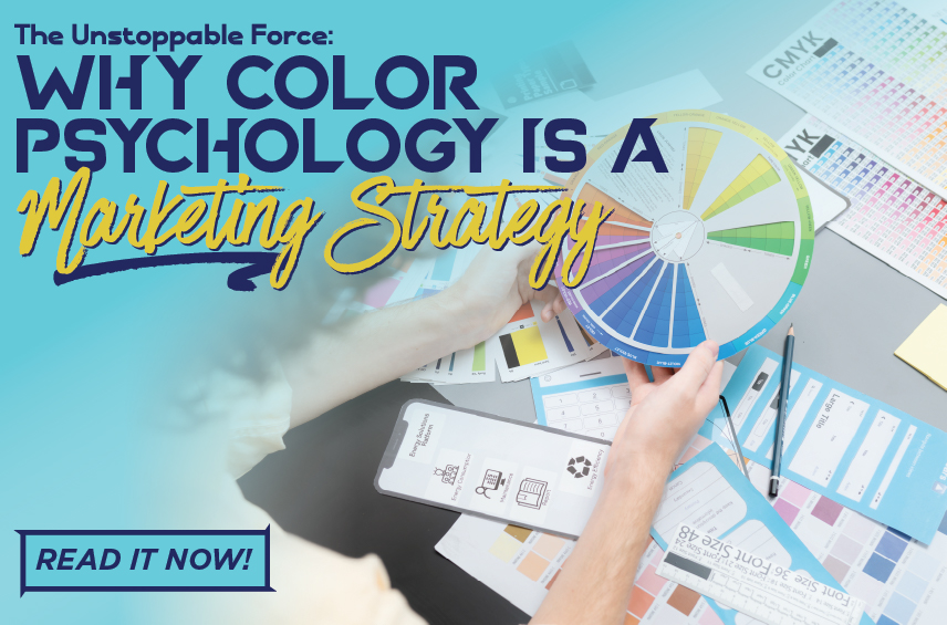
Color psychology is the study of how colors affect human behavior and decision-making. In marketing, it is the silent salesperson that sets the tone for your entire customer journey.
Different colors evoke very specific, deeply ingrained emotional responses:
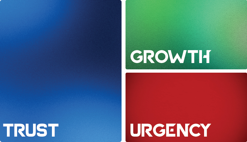
- Blue: Evokes trust, security, and stability. (It is why almost every bank, tech giant, and healthcare facility uses blue).
- Red: Creates a sense of urgency, excitement, and appetite. (Think clearance sales, fast food, and emergency services).
- Green: Signals growth, health, wealth, and nature. (Perfect for financial planners, outdoor brands, and wellness companies).
- Black: Communicates luxury, sophistication, and exclusivity. (Think high-end fashion and premium car brands).
If your marketing strategy is promising a highly secure, reliable B2B service, but your brand colors are chaotic neon yellow and pink, you are sending mixed signals. Your visuals are actively fighting against your messaging.
The Consistency Trap: Why Sticking to the Palette Matters
Choosing the right colors based on psychology is step one. Step two—and where most businesses fail—is consistency.
We talk a lot about the “Consistency Trap.” If you have a sleek, trustworthy blue website, but your social media graphics are a disorganized rainbow and your email newsletters are using three different shades of teal, you break the psychological loop.
Visual inconsistency translates directly to unreliability in the mind of the consumer. If a brand cannot keep its own colors straight, a customer will subconsciously wonder if they can be trusted to handle their business properly. Consistency is what builds brand recall. You want your audience to be able to instantly recognize a social media post as yours just by the color palette, long before they even read your logo.
The Unstoppable Force: When Marketing Meets Branding
Marketing is the engine that drives traffic to your business. Branding is the vehicle that ensures they actually want to get inside.
When you have a strong, aggressive marketing strategy operating independently of your branding, you get high traffic but low conversions. When you have a beautiful brand with no marketing strategy, you get a gorgeous website that no one ever sees.
But when you pair a highly targeted marketing strategy with a deeply intentional, psychologically optimized, and consistent brand identity? You create an unstoppable force.
Your ads catch their attention. Your brand colors instantly communicate the right emotion. Your consistent visuals build instant trust. And your seamless user experience closes the deal.
At Vitality South, we don’t just pick colors because they look nice. We engineer high-performance visual identities that support your business goals. When every piece of your brand is pulling in the exact same direction, scaling your business stops feeling like a struggle and starts feeling like momentum.